If you run an online business, your website will act as your virtual storefront. It’s where people will go to learn more about your business and decide whether they would like to invest in your products or services.
In order to attract the right people, earn their trust, and generate plenty of sales for your company, you need to ensure your website provides a great first impression. If your website gives off an unprofessional feel or it’s hard to navigate, people will be wary and this will reduce the chances of them spending money with you.
Here, we’re going to help you improve your business’s website so you can get the best results. Read on to learn more.
Use imagery to help customers connect with your products or services
The imagery you choose to use on your website will have a huge impact on how people perceive your business. So, you need to ensure you put plenty of time and energy into taking or sourcing the right pictures.
The goal of your images should be to help your ideal clients connect with your products, services, and business as a whole. You also want to show your company in the best light so people are inclined to trust you and make a purchase.
There are a range of approaches you can take when choosing imagery for your website. Firstly, if you have a product-based business, you need to ensure you have high-quality photographs of every item, and try to make sure these highlight all of your products’ features and applications. This will make it easier for people to imagine actually using what you offer, so they’ll be far more tempted to buy from you.
You could also take photos of your team and display them throughout your website to humanize your business. People don’t like to buy from faceless entities — they would much rather spend money with someone that they feel they know. And, this is a very easy but effective way to build stronger connections with your ideal audience.
If you offer products or services that can be difficult to explain in words, you may also want to add diagrams or illustrations to your website. These could be used to clearly map out different processes, show how different elements of your products work, or give people an idea of exactly what they can expect from your business.
Finally, consider featuring images of people who look just like your target customers. For instance, if you run a B2B business that provides accounting software, you could add photos of relatable businesspeople to your site. Or, if you stock children’s toys and clothes, you could display images of different families enjoying the items you offer. It’s all about making sure your ideal customers feel welcome when they land on your site.
To give you some imagery inspiration, let’s take a look at two businesses that have done a great job of providing a fantastic first impression with their websites’ photos.
GSD Painting Contractors is a business that helps people to bring their interior design dreams to life. And they make it easy for prospective clients to imagine just how great their homes could look after an overhaul by displaying some of their best work on every page of their website.
As you can see, right on their homepage people will come across an incredible photo of some beautiful interior design work that was completed by the company. Photos like this are scattered throughout the website, and there are so many different styles of project that people who are thinking about hiring the company are sure to find something that reflects exactly what they’re looking for.
To give people a great first impression of your business, you can do the same by showcasing some of your best work at every opportunity. And, also focus on trying to show the breadth of your skills by showing off all the different kinds of products, services, or bespoke projects you’ve provided for people in the past. It’s likely to do wonders for your website’s conversion rate.
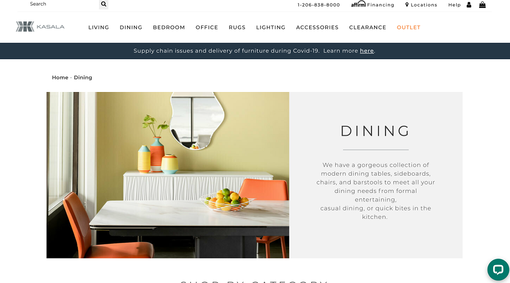
On the other hand, Kasala is a product-based business that offers home furniture and accessories that people can purchase. And, they use imagery to help people imagine their different pieces in their homes.
Take their dining furniture page, for instance. As you can see in the screenshot above, they’ve set up a dining table and chairs that they sell to look like it’s in someone’s home. They’ve added a matching vase and even a fruit bowl to make the image as homely as possible and provide potential customers with plenty of decor inspiration.
Showcasing their items in situ is a great way to show people how functional and fashionable they are, which is a fantastic tactic for convincing more people to buy from the company. You can do something similar by showing off your products in the situations or settings customers will actually use them in. It can really help to bring your offerings to life.
To get the most out of your imagery, you also need to ensure your website’s images are optimized. For more information about this, check out WebKu’s guide to optimizing online images.
Highlight what helps you to stand out from the competition
The main reason you want to ensure your website gives off a good first impression is that you want to convince people to shop with you, rather than your competitors. So, you should also try to highlight what truly helps you to stand out from the crowd.
There are a number of tactics you can use to prove that you’re better than all the other companies out there that offer the same products and services. For instance, you could start by showcasing your unique selling points. This could include if you offer free delivery, an extended returns policy, or you donate a percentage of your profits to charity, for instance. Anything that you do that your competitors don’t should be highlighted.
You could also showcase the results you’ve gotten for past clients — this is a particularly helpful approach if you run a service-based business, as it can help you to earn new customers’ trust. You could put together case studies that show off the best work you’ve done so far, for example, and make sure you use facts and figures to provide concrete proof of your skills and the results you can get.
Finally, another way you can help your business to stand out from the crowd is by running regular promotions that will save your clients money. Make sure you publicize these throughout your website to grab people’s attention. If people know your products or services are more affordable than those offered by your competitors, you’re likely to attract their business.
Ensuring your business stands out from the competition is key to succeeding in your field, so you should take steps to give a great first impression by highlighting what makes your company so great on your website.
Showcase any positive reviews from past customers
Another way to ensure your website provides a great first impression of your business and show prospective customers you’re great at what you do is by showcasing any positive online reviews you’ve received from past clients.
For product-based businesses, star ratings or short and snappy written reviews can be especially helpful, as they will allow new customers to compare and contrast your products easily. These also tend to be the easiest to collect, as they don’t require too much input from your clients — you can simply ask them to give you a satisfaction score out of five along with a couple of lines about how they found your service.
If you have a service-based business, people will likely want more context about what you do and the types of results you get before investing in what you offer. To collect these, you may want to arrange a phone call with your past clients or send them a questionnaire with open questions so you can get their thoughts and then narrow them down to the most important points.
Once you’ve collected your reviews or testimonials, you’ll then need to decide how you’re going to display them on your website. It’s always best to add some to your homepage, as this will grab people’s attention straight away and prove that they can trust you. It’s also a good idea to add your reviews to your corresponding product or service pages to increase your chances of making sales. If you have a lot of feedback from past customers, you could even dedicate a whole web page to all of your reviews, too.
To give you some inspiration, let’s take a look at a number of businesses that have done a great job of displaying social proof to ensure their websites give a great first impression of their companies.
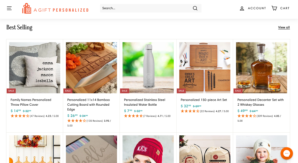
A Gift Personalized is an eCommerce site that offers a wide range of present ideas that can then be made even more special with an element of personalization. And, to help their customers to choose between all of the different items they stock, they’ve used simple star ratings to show what previous customers have thought of them.
Not only does the company display the stars for each product, but there’s also a numerical rating and clarification on how many reviews each product has received. This is sure to help win more people’s trust and give a much better impression because it proves there’s a consensus among the company’s many customers that their products are great.
If you offer a lot of interchangeable products that prospective buyers might struggle to choose between, you could use a similar tactic on your own site. It’s sure to make the shopping experience much easier for people looking to buy from you.
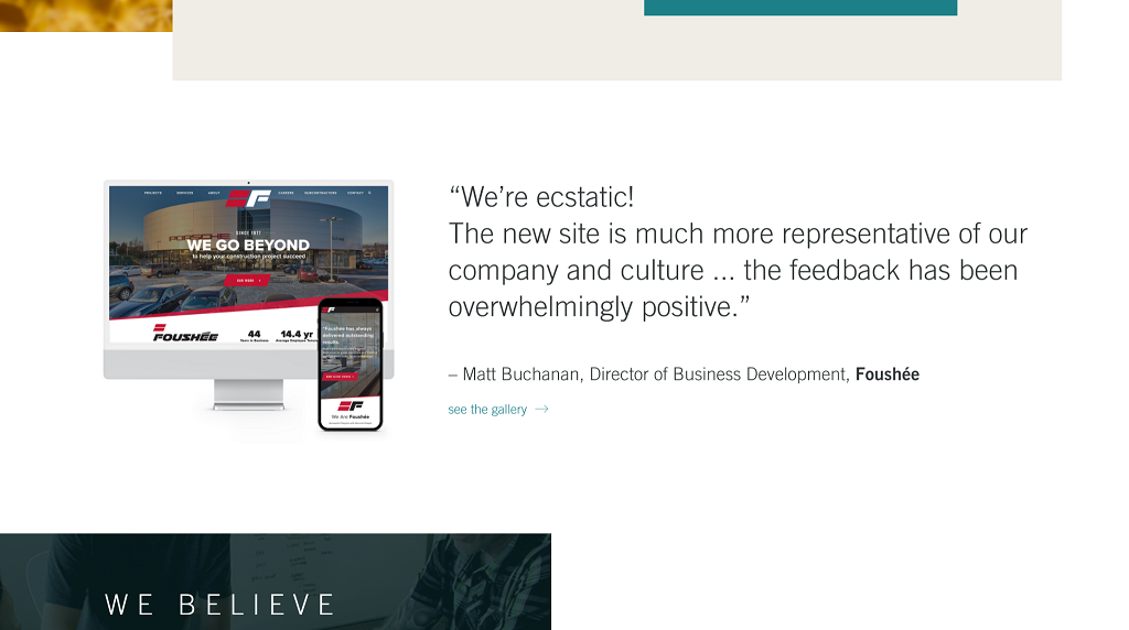
On the other hand, Bizango is a service-based business that provides web design and digital marketing support. So, they’ve opted to give off a good first impression by highlighting positive written testimonials on their homepage.
As you can see, they have a very enthusiastic testimonial from a happy customer, and this is also accompanied by the review provider’s name, job title, and company name. This gives Bizango’s testimonials an extra level of credibility, which is sure to help build more trust with prospective clients. Plus, the company has even chosen to showcase a snippet of the work they actually did for this client to the left of the review, which shows off their skills even further.
This is a great tactic that a lot of service-based businesses will be able to replicate. Choose a standout quote from your clients’ feedback and display it alongside some of the work you did for them. It will provide a great first impression and convince more people to spend money with you.
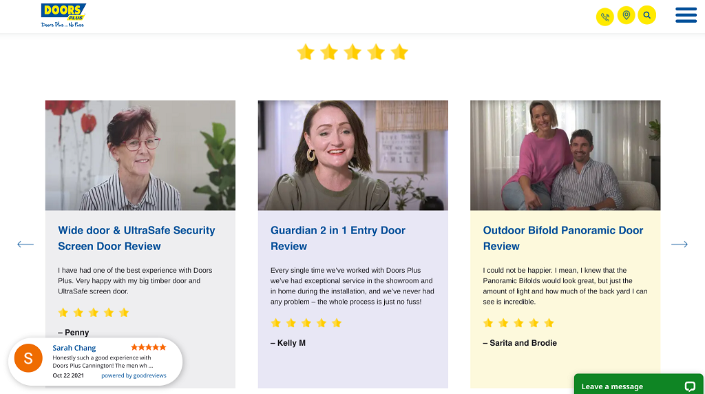
Finally, Doors Plus is a company that specializes in helping customers to upgrade the interior and exterior of their homes with new doorways. And, they do a fantastic job of showing just how great they are at this by publishing a range of positive reviews on their website’s homepage.
As you can see, they’ve used a combination of the two tactics from our previous examples, as they’ve chosen to use both star ratings and written reviews. For people who are trying to make a decision quickly, the ratings will be very helpful, while the longer testimonials will be beneficial for people who need more context and reassurance.
The company has also highlighted which products these customers bought, added their photos to humanize their reviews, and provided their names to give these testimonials more credibility. All of these elements come together to really show that Doors Plus are known for providing a fantastic service.
Consider whether it could be worth adding a combination of reviews to your website like this. Adding headshots can also help prospective clients to feel better connected to the people who have provided you with their feedback, which could increase their trust in your business and lead to more conversions.
Highlight any awards or qualifications relevant to your field
Another way you can provide concrete proof that you’re great at what you do and leave a fantastic first impression on prospective clients is by showcasing any awards or qualifications you have related to your field of work.
This is a particularly great idea if you work in a more serious field, such as the financial, law, or medical sectors. In these fields, you need to work very hard to earn your audience’s trust, as they need to be very confident that you’re going to be able to support them and possibly help them through some very difficult times. So, if you have been given any relevant awards for your work or you have qualifications that prove you know your craft inside and out, adding these to your website can really help to put your target customers at ease.
To keep things as clear and simple as possible, stick to displaying the qualifications and awards that are most relevant to your work. They should also be as recent as possible, so prioritize awards you’ve won in the last couple of years, for example, over those you may have received a long time ago. People will want to know that you’re still being recognized for your great work today.
Make it as easy as possible for people to buy from you
Finally, to give people the best possible impression of your business, you want to make it very easy to buy from you. This will show that you respect people’s time, want to make life simple for them, and completely understand their needs.
There are a number of ways you can provide a positive user experience that will make life easy for your customers. For instance, you could have a sophisticated search tool on your homepage that requires just some simple details to direct prospective customers to the exact products or options they need. For instance, a real estate company could have a search field that asks for a ZIP code target clients are looking to buy in, or a skincare retailer could have a search tool that allows you to input your skin type to find the best moisturizer to suit your needs.
If people tend to want to get in touch before investing in your products or services, you could highlight your contact details very clearly on each page of your website. For instance, you could include your phone number and email address in your navigation menu, add a contact form to every page, and have a live messaging service that follows users around your site for when they need it. Being able to get in touch quickly and easily will make the buying process much simpler for your customers, which will leave a good impression and lead to more sales.
Clear calls to action can also ensure your customers are always aware of what they need to do next if they want to move further through your sales funnel. These are instructions — typically placed on a button — that should remove any mystery from your buying process. For instance, you could use a call to action to tell people to “try for free”, “buy online today”, or “get in touch with us now”.
All of these tactics can help to improve your conversion rate, as the easier it is for people to invest in your products or services, the more likely they’ll be to buy from you. Plus, this will leave a lasting positive impression so people will be more likely to come back to shop with you again.
Summary
Ensuring your website provides a great impression of your business is incredibly important if you want to succeed online. And all of the tips we’ve outlined in this article will help you to attract your ideal audience, win their trust, and make more sales.
Would you like more advice that will help you to develop your business? Check out WebKu’s business section for more expert information!
Author bio & headshot:
Aaron Haynes is CEO and co-founder of Loganix. The company is an SEO fulfillment partner for digital marketing agencies and professionals, which provides the services businesses need to improve their online visibility and grow. If you liked this article, check out the Loganix blog, where you’ll find more SEO guides full of expert advice.


Add Comment