Providing your customers with a positive shopping experience is one of the most important aspects of running a successful online business. Improving your customer experience can lead to more sales, improve your reviews, and ultimately grow your bottom line. In this article, we’re going to outline how you can provide your customers with a great shopping experience.
Let’s get started.
Make sure it’s very easy to use your website
You need to ensure that your website is easy to use and navigate — if a website visitor has trouble finding what they need, they won’t stick around long enough to make a purchase.
Additionally, providing a positive user experience (UX) is a great way to boost your search engine optimization, or SEO, for your eCommerce business. Essentially, search engines only want to send their users to websites that they’ll enjoy using. So, having a great UX can improve your rankings so you move up the search engine results pages (SERPs) that are relevant to your business. This will then send more quality traffic your way.
Here are just a few tips that will ensure your website offers a good UX:
- Make sure it has a fast loading speed (try to keep it under two seconds)
- Design a simple and intuitive navigation system
- Create a sophisticated search tool that helps website visitors find the products or services they need
- Make sure your website is mobile-friendly and accessible
You can help people navigate your website by providing them with options relevant to their needs. For instance, a website visitor might want to browse your store via different product categories, or by the type of customer they are (for instance, if relevant, you could have two menu options like “for teachers” and “for students”). This will make it easier for the user to take the next step with your business!
Let’s take a look at a few businesses that have easy-to-use websites for inspiration.
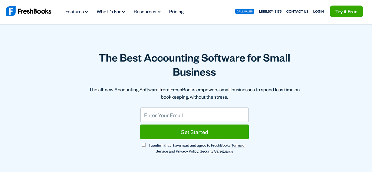
FreshBooks, an online accounting software company, makes it very easy for customers to take the next step on their small business accounting software product page.
As you can see in the image above, people interested in this product from FreshBooks only have to plug in their email address to get started. Easy, right? Requesting just a small amount of information from website visitors can make taking the next step much more simple, encouraging them to make a purchase. By making the next step so easy to take, FreshBooks provides a positive shopping experience.
On your website, consider doing something similar. Only ask for a small amount of information to get website visitors started with your products or services — if all they need to offer at first is their email address, they’ll be more likely to jump into your sales funnel!
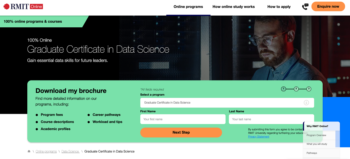
RMIT Online, a higher education institution based in Australia, also makes it easy for prospective students to take the next step on their program page for their graduate certificate in data science.
As you can see in the image above, a prospective student simply needs to select their program and enter some basic information, like their name and email address, in order to download a brochure about the course. Not only does this provide users with more information about their choice of program, but it also adds them to the RMIT Online mailing list, meaning they’ll get updates in their inbox regularly. This can help to greatly enhance the student experience.
On your website, help create a positive shopping experience by making it easy for customers to take the next step with your business, as RMIT Online has. If you can make it easy for the user to learn more about your products or services, they’ll be more likely to spend money with you!
Provide content that addresses your audience’s pain points
You want your audience to feel like you understand them and want to help solve their problems. Publishing the right types of content can help with this! Create content that addresses their pain points or answers their questions — this will help you build trust with visitors, making it more likely that they’ll buy from you in the future.
There are a ton of different types of content that you can create to address customer pain points. For example, you could create an FAQ guide that addresses common questions people have, write a blog post outlining a process, or create videos that show the user how to maintain your products. The right types of content will help to address your audience’s pain points, demonstrate your expertise, build trust with your customers, and ultimately earn you more sales.
Let’s take a look at a few examples of businesses that address customer pain points in their content for inspiration.
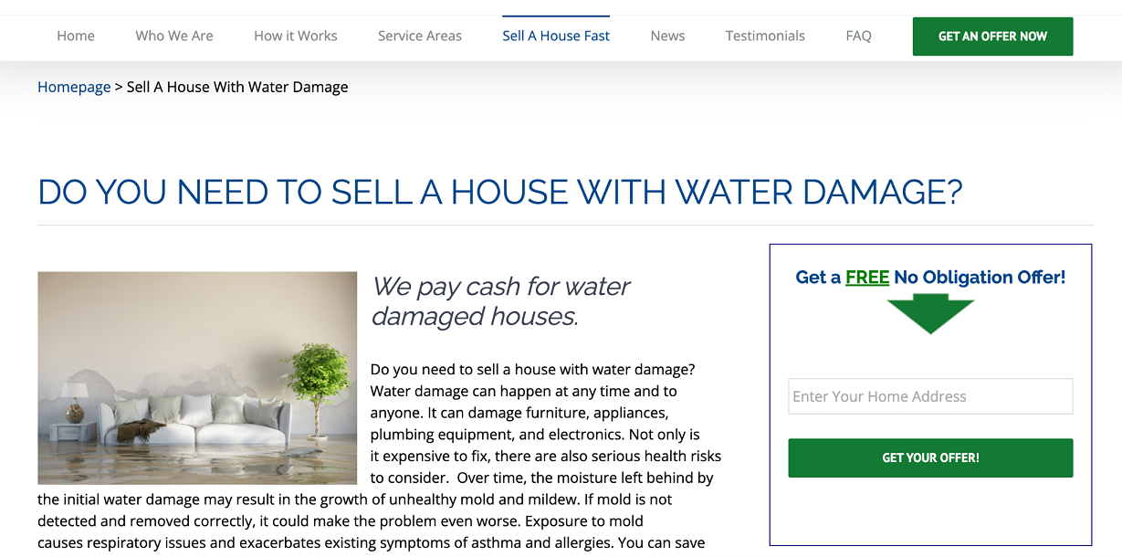
Highest Cash Offer, a real estate solutions company in Scottsdale, Arizona, addresses customer pain points throughout their blog. One particular article on selling a house that has water damage does a few things well. It outlines some of the problems water damage can cause and how important it is to solve them, but also highlights that Highest Cash Offer will still pay cash for water-damaged houses.
So, not only does the piece address a common pain point among homeowners, but it also provides a very solid solution and promotes the company’s services. People who are worried about whether or not they’ll be able to sell their property can turn to Highest Cash Offer. People researching solutions to this problem might come across the company’s article and learn that they don’t have to worry, which provides a great customer experience.
Think about what pain points your customers have, and how your products or services address them. Outlining these solutions in your website content can make the shopping experience much easier for your customers!
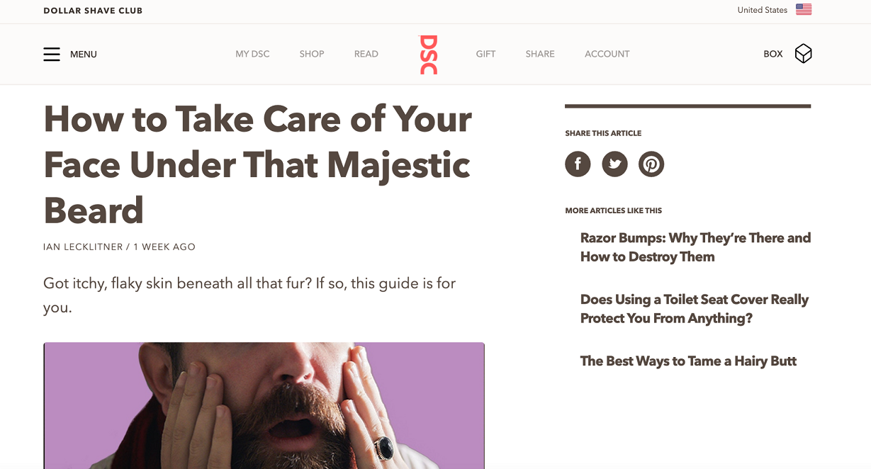
Dollar Shave Club, an online razor subscription service, also addresses customer pain points throughout their blog. Their article on skincare with a beard does several things very well, for instance. They note that, with the right skincare routine, it’s possible to have smooth and clean skin under a beard. Then, they go on to outline how to clean your face, exfoliate, moisturize, and more. This article is great for the Dollar Shave Club’s target audience — many of them have beards and are concerned with their overall hygiene. By outlining this process, they can address a customer pain point while promoting their products, meaning this is a great article for improving the customer shopping experience!
On your website, consider using a similar strategy to Dollar Shave Club. Think about what types of problems your customers have. What are they concerned about, and how can your products or services help? Creating high-quality content that addresses their problems can improve the shopping experience.
Ensure your contact options are easy to find and access
Some people that visit your website might have questions or concerns about your products. To help put their minds at ease and bring them closer to making a purchase, you need to make it as easy as possible for them to contact you.
Keep in mind that different people will want to contact you in different ways — this means that you need to give several different options to your website visitors, such as email, phone, live messaging, and social media. It could even be worth surveying your customers in order to see what options they would prefer to ensure you’re meeting their needs.
Let’s take a look at a few examples of websites that do a good job of communicating their multiple customer service options for inspiration.
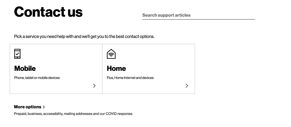
Verizon, an American wireless network operator, makes it easy for customers to find the proper contact option for them on their Contact Us page. As you can see in the image above, there are two clear options for a visitor: are they looking for support with home devices, or mobile services? A user clicks one of the two options, and then they can get support for specific topics, like troubleshooting, billing, account management, and more. Finally, after selecting a topic, they have the option of a live chat service or phone support.
This is a great way for Verizon to streamline their customer service support and create a better customer experience. The design of these pages is very simple, and it’s clear where the user needs to go to get the specific help they need. If they’re looking to make a purchase, they can quickly get in touch with any questions, improving the shopping experience.
On your website, consider presenting your customer service options in a way similar to Verizon. Offering multiple options for them to choose from can help them get the information they need and quickly get their concerns resolved, bringing them closer to making a purchase and improving the shopping experience.
Anthropologie, an American clothing retailer, ensures that their contact options are easy to find on their website, as well. If you go to their website, one of the first things that pops up is the option for a live chat service. Even if a user doesn’t need this service right away, it’s very clear that it’s an option, should questions come up. This helps improve the shopping experience because visitors know that they can call on a customer support representative whenever they have a query or concern.
On your website, consider offering a live chat service and notifying your website visitors when your agents are available, as Anthropologie has. This will let your customers know that someone is ready to help them if any questions arise, improving the customer shopping experience.
Use social proof to earn your audience’s trust
Word-of-mouth recommendations are incredibly powerful! You can replicate this effect by adding customer reviews to your website. This will help new customers and website visitors feel more confident when buying from you. This means that they’ll have a better shopping experience and they’ll be more likely to come back for repeat purchases!
Let’s take a look at a few examples of businesses that incorporate reviews into their web pages for inspiration.
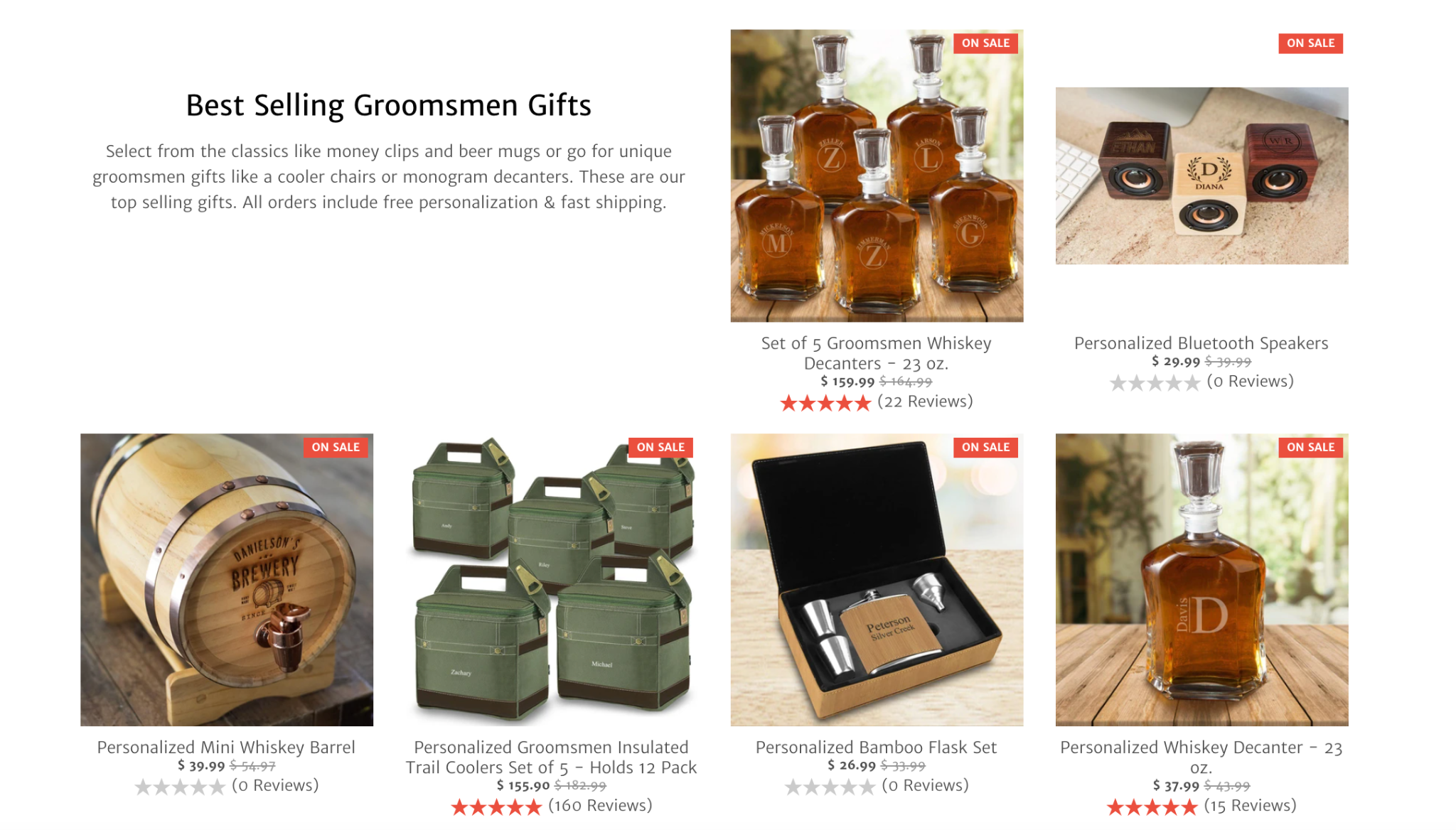
GroomsShop, a retailer of personalized groomsmen gifts, shows off social proof right on their homepage. As you can see in the image above, they use star ratings to show just how highly rated some of their products are. Think about how important social proof is for a personalized gift retailer. Website visitors are going to want to know if GroomsShop provides high-quality and accurate personalizations. By looking at the star reviews, a visitor is able to quickly compare multiple products and get a feel for what to expect.
On your website, consider using star reviews as social proof. These will show that your products are quality, making website visitors more likely to trust you and make a purchase.
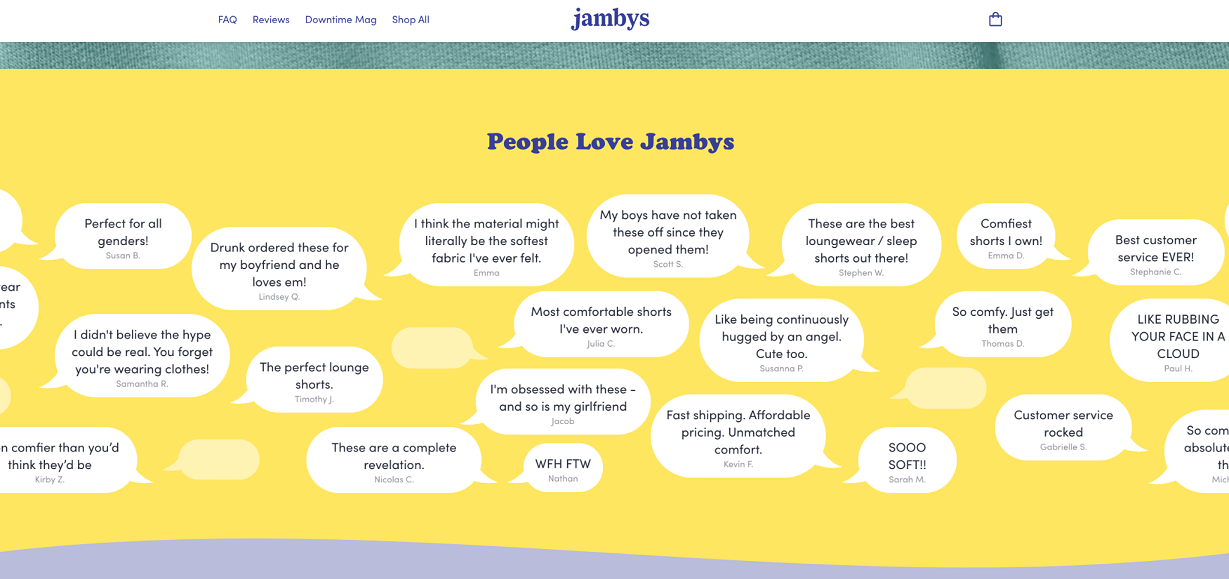
Jambys, a loungewear clothing retailer, uses social proof on their website in a way that’s a bit different. As you can see above, they have a series of speech bubbles featuring short quotes from their past customers. This is a clever way to show that people are talking about Jambys and that they love them! By showing off social proof in this way, Jambys is able to build trust with website visitors, bringing them closer to making a purchase and improving their shopping experience.
On your website, consider showing off quotes from customer reviews to build social proof. And don’t be afraid to incorporate them creatively into your web design, as Jambys has. This will keep people engaged and encourage users to continue looking around your website, improving their overall experience.
Give customers the chance to personalize their experience
Personalization is becoming increasingly important for winning over new customers and growing a business. This means that you need to do everything you can to help your audience customize their experiences with your company!
Interactive elements offer a great way to help personalize the website experience for your visitors. Calculators that help them solve a problem, quizzes that tell them more about what products or services they need, or virtual try-ons can all be helpful, keeping visitors engaged and providing them with a positive shopping experience.
Let’s take a look at a few examples of businesses that use interactive elements to personalize the customer shopping experience for inspiration.
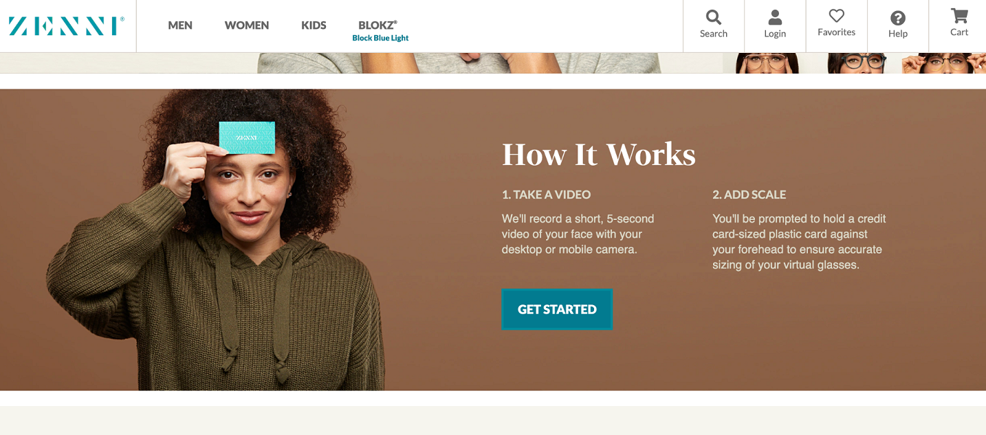
Zenni Optical, a glasses retailer, has a virtual try-on tool on their website that helps a user personalize their experience. This lets a customer see what their glasses will look like on them without even having to go into a store!
To get started, the user just needs to take a short video and hold a credit card for scale. Then, they’ll be on their way to finding the perfect pair of glasses! Not only is this an engaging interactive experience, but it helps personalize the shopping experience for the user. They’ll know what to expect when their glasses arrive, helping to ensure better purchases. This is a great way to provide a positive shopping experience!
On your website, you could replicate this if you sell cosmetics or accessories. This will help give your customers a better idea of what your products will look like on them, so they’ll be more likely to be happy with their purchase. These virtual try-ons offer a great way to improve the shopping experience!
On the other hand, Jackson Hewitt, an American tax preparation company, has a variety of tax tools on their website that help to personalize the user experience. As you can see above, some of the free tools they offer include a federal income tax estimator, a self-employment tax estimator, and a stimulus check calculator. A user simply clicks the tool they want to use and then offers up some basic information in order to get an idea of what their tax refund will be.
This is a great way for Jackson Hewitt to personalize the experience for their website visitors. If users find the tool to be helpful, it will make them more likely to make a purchase, creating a positive shopping experience.
On your website, consider offering free tools in order to get people started with your business. If you have a variety of tools to solve their problems, this can customize their visit and help them determine which of your services or products they need. This will then help to improve their shopping experience overall.
Help customers to feel connected to your business
If someone feels a connection to your business, they’ll be much more likely to have a better experience of shopping with you. Not only does this mean they’ll be more likely to make a purchase, but it means that they’ll trust you more and want to come back.
Here are a few different ways you can help build a connection with your customers:
- Humanize your business by showing off pictures or videos of yourself or your team
- Show the behind-the-scenes aspects of your business, like what a day in the office is like or how you make your products
- Share user-generated content, like the shoutouts you get on social media
- Engage with your customers by replying to reviews or social media comments
Let’s take a look at a few examples of businesses that have found a way to build a connection with their customers for inspiration.
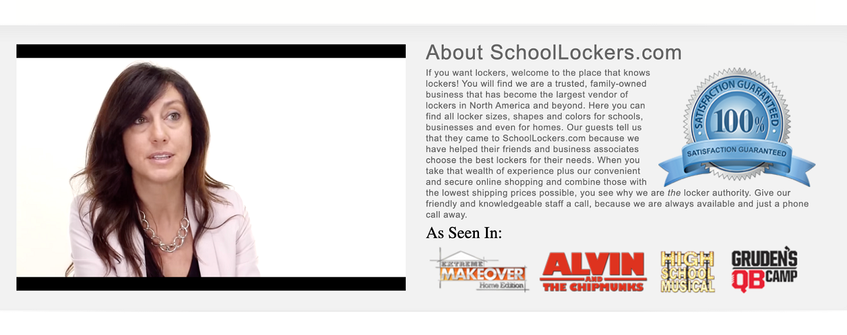
SchoolLockers.com, a retailer of school lockers and storage cabinets, humanizes their business using video on their homepage. If you scroll down to the bottom of the page, there is a short video that includes interviews with staff members from SchoolLockers.com and shows off their employees cleaning and installing their lockers.
This is a great way to humanize the business — it shows the people behind the company and their passion for the products they offer. This helps a website visitor feel more connected to SchoolLockers.com, making them more likely to make a purchase.
On your website, consider using video to introduce your team and show your employees at work, as SchoolLockers.com has. This can help you humanize your business and bring customers closer to making a purchase while improving their overall experience.
Finally, The Foggy Dog, a retailer of dog accessories, humanizes their business on their About Us page. As you can see above, there is a short letter from the founder, who outlines why she started her business and how much she loves her dog, Utah. This shows website visitors that Rose, the owner, is an enthusiastic dog owner, just like them! This helps to humanize the business, building a connection with prospective customers and making for a better shopping experience.
On your website, consider showing off an image of yourself and sharing some information about your background. How did you get started in your field, for example? If you do this, you can humanize your company and make customers more likely to trust you, helping to create more loyal customers and improving your shopping experience.
Summary
You want all of your customers to have the best experience possible — this will help ensure that they spend money with you and keep coming back! In this article, we outlined how you can provide your customers with a positive shopping experience, including by building a connection with them, making your customer service options easy to find, showing off social proof, and more.
Need more help? Check out some of the other articles in the WebKu business archive. They have articles on improving office productivity, creating a successful eCommerce business, and more.
Author bio & headshot:
Aaron Haynes is CEO and co-founder of Loganix. The company is an SEO fulfillment partner for digital marketing agencies and professionals, which provides the services businesses need to improve their online visibility and grow. If you liked this article, check out the Loganix blog, where you’ll find more SEO guides full of expert advice.








Add Comment